
Styling a Gift Box Around a Personal Touch
A custom gift feels even more meaningful when the packaging supports the message inside. A well-styled box can guide the mood before it is even opened, helping the recipient feel considered from the first glance. With a few choices in color, texture, and wording, you can turn a simple handoff into a polished gift experience.
Explore ↗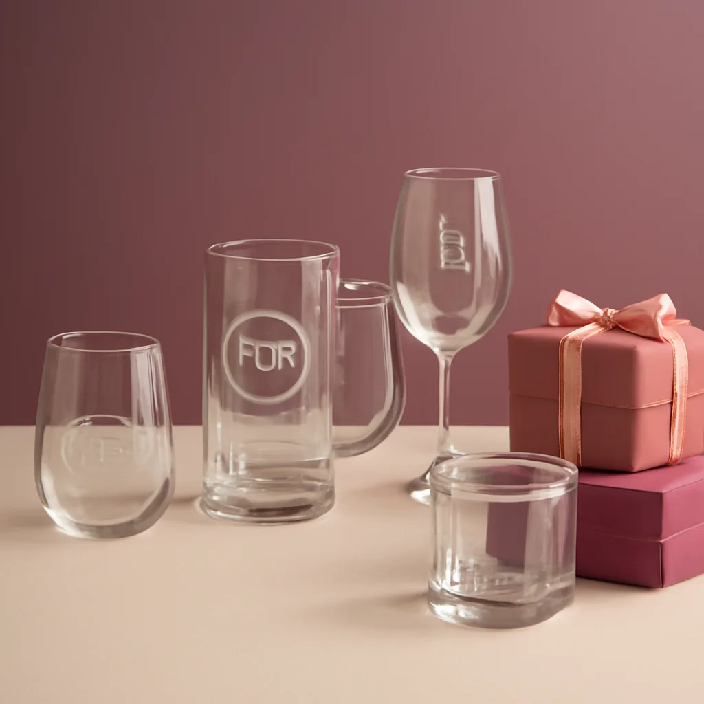
Start With the Feeling You Want to Create
Before choosing tissue paper or ribbon, decide what the gift should feel like when it is opened. Do you want it to feel calm and refined, bright and celebratory, or warm and intimate? That emotional direction makes every packaging choice easier, because the box becomes part of the story rather than just a container.
A personal touch works best when the packaging matches the occasion and the recipient’s style. If the gift is meant to feel elegant, use restrained colors and clean lines. If it is meant to feel playful, use bolder contrast or layered textures. The goal is consistency, so the outside of the box supports the personality of the gift inside.
- Choose one main mood: elegant, cheerful, soft, modern, or nostalgic.
- Limit the color palette so the box feels intentional.
- Think about the recipient’s taste, not just the occasion.
Build a Color Palette That Supports the Message
Color does a lot of quiet work in gift presentation. A single accent color can make a box feel tailored, while too many competing shades can make it feel scattered. Start with one base tone, then add one or two supporting colors that echo the item inside or the message you want to send.
If the gift includes a personalized item, choose colors that do not compete with the custom detail. Soft neutrals can frame a name, date, or monogram without overwhelming it. Deeper tones can add contrast and make the main piece feel more elevated. Even simple combinations like white and gold, cream and blush, or black and silver can create a clear visual direction.
Texture matters too. Matte paper, satin ribbon, crinkled filler, or a smooth insert all change how the box feels when opened. When possible, use texture to add depth while keeping the palette simple. The result feels layered without becoming busy.
- Use one base color and one accent color for clarity.
- Let the packaging frame the personalized item, not compete with it.
- Mix textures instead of adding more colors if the box needs interest.
Use the Message Card as Part of the Design
A message card should do more than explain the gift. It can act as a design element that ties the whole package together. Match the card stock, font style, or border details to the overall look of the box so the note feels like it belongs there.
Keep the message short and specific. A few thoughtful lines often feel more sincere than a long paragraph. Mention why the gift was chosen, what it is meant to celebrate, or what memory inspired it. That context gives the recipient a stronger sense of connection.
If the gift has a name, phrase, or date included in the customization, echo that detail on the card so the presentation feels unified. This small repetition can make the gift feel carefully planned instead of assembled at the last minute.
- Keep the note short, direct, and personal.
- Repeat one design detail from the item in the card design.
- Use the card to explain the meaning behind the gift.
Finish With Details That Make the Box Feel Complete
Small finishing touches can make a box feel considered without adding clutter. A neatly folded liner, a simple seal, a fabric tie, or a single decorative insert can create a polished final look. The key is restraint: each detail should serve the same mood as the gift itself.
Think about the opening experience. A box that opens cleanly and reveals each layer in order feels more intentional than one packed loosely. Place the most important item where it is immediately visible, then use filler or tissue to support it rather than hide it. If there are multiple pieces, arrange them so the recipient can understand the gift at a glance.
Keep practical details in mind as well. The box should be sturdy enough to protect the contents, and the decorative layer should not make it difficult to open or handle. Good styling should feel effortless for the recipient, even if it took careful planning behind the scenes.
- Use one final accent, not several competing ones.
- Place the main item where it is easy to see first.
- Balance beauty with protection and ease of opening.
A Simple Formula for a Memorable Presentation
If you want a reliable approach, use this order: choose the mood, select the colors, add the note, and then finish with one or two styling details. That sequence keeps the presentation cohesive and prevents overdecorating. It also helps the personal touch remain the focus, which is what makes the gift feel meaningful in the first place.
When the box feels aligned with the message inside, the entire gift reads as more thoughtful. Packaging becomes part of the experience, not an afterthought. That is what gives a custom gift its completeness: the recipient sees care before they even reach the item itself.
- Mood first, then colors, then message, then finishing details.
- Keep the design simple enough to let the personal touch stand out.
- Aim for a presentation that feels thoughtful from the outside in.
Discover
How to Choose the Right Glassware for a Gift
A practical guide to matching glass shape, style, and occasion so your glassware gift feels thoughtful and fitting.
Personalization Ideas for Weddings and Celebrations
Practical wording and design ideas for wedding and celebration personalization, including names, dates, initials, event themes, and layout choices.
Caring for Customized Glassware
Simple care guidance for personalized glassware so decorative details stay clear, clean, and looking their best over time.
Gift Planning for Small Events and Party Favors
Plan cohesive favors and small-event gifts with a simple theme, practical quantities, and personal details that feel thoughtful without overcomplicating setup.